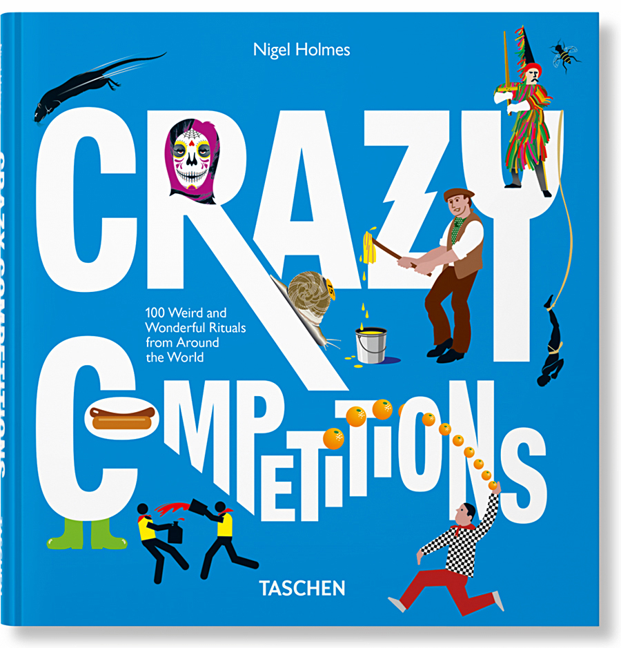
INSIDE NIGEL HOLMES’ INFOGRAPHIC MIND.
This is the second post about Nigel’s new book. The first one is here: https://wp.me/p7LiLW-2oj
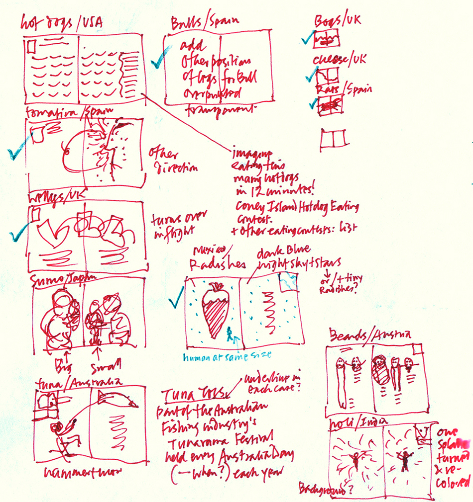
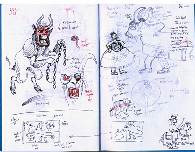
Above, from Nigel’s notebook, these are the very first (and very rough) sketches for the 12 spreads that he eventually developed and sent to Taschen to sell the book idea. He originally intended the format to be small and portrait-shaped, with very simple graphics and minimal text.
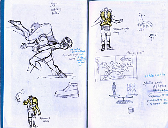
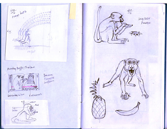
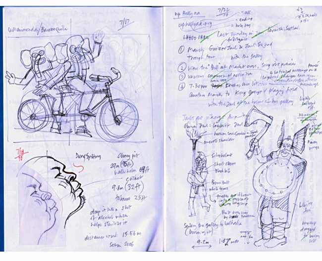
More pages from Nigel’s notebooks:
Q&A
I recently asked Nigel some questions about the book.
This is an unusual subject. In fact, the working title was “Odd.” So first, I have to ask: Why?
I really wanted to do a book that included infographics but wasn’t academic, or “how-to-do-it.” Yes, I wanted to call it “Odd” because I loved the idea of designing a cover with just that one word on it. But the sales people overruled me! Actually, the title changed three times during the making of the book: “Odd,” “They Throw Dead Rats in Spain,” and “Wow!” before “Crazy Competitions.” I argued against the final title, first because the events aren’t all competitions, and also the word crazy might offend the sensibilities of participants taking part in the many religious-festival-based events. But this was the only point of contention in the entire job. Like myself, Taschen really wanted the book to be fun, accurately-researched and approachable.
It’s one thing to have a creative book idea, and another thing to get it published. (Especially by such a prominent publisher.) How did you that happen?
I met Julius Wiedemann, the senior editor at Taschen at a graphics conference some 10 years ago, and we kept in touch. At lunch in June 2015, I casually mentioned the idea of a small graphic book about weird events, and he was interested. He suggested I do ten of them and he’d see if the idea would fly with his boss, Benedikt Taschen. To my surprise, the boss said yes! But he would like it to be a collection of 100! Again to my surprise, it was easy to find that many. Julius has been a wonderful partner in the project. He told me just a couple of months ago that he had miscalculated the amount of time the translations would take. (Taschen typically publishes everything in English, French, and German.) Also the sales team at the head office in Germany were not sure about how they’d sell the book; in fact they were rather against publishing it. Julius got Benedikt to say he wanted the book to be done, and that was that.
Although the approach, in terms of visual explanation, is unquestionably very “Nigel Holmes-like,” you use several different styles of illustration. Was this a deliberate decision to make the spreads more varied visually?
I treated this book more like a series of magazine pages than traditional book pages—after all, most of my career has been in magazines. So yes, it was a very deliberate decision to give readers a variety of things to look at, rather than setting everything in a strictly formatted approach. (The color bars on the edges of each page and the two outside columns were a kind of recurring format, and that was enough.) Also, frankly, I wanted to amuse myself for the year-plus it took to draw and write everything, and in any case, many of the events were difficult to portray as “proper” information graphics. So I used freehand drawing for the real action events; I think a freely drawn line has much more energy and life than my rather stilted vector illustration. (An aside for computer nerds: the vector program I used for the whole book (text and art) was Freehand MX. I saved my files in Illustrator format for the production guys in Germany.)
Can you detail the process of creating the graphics? From idea to finished spread.
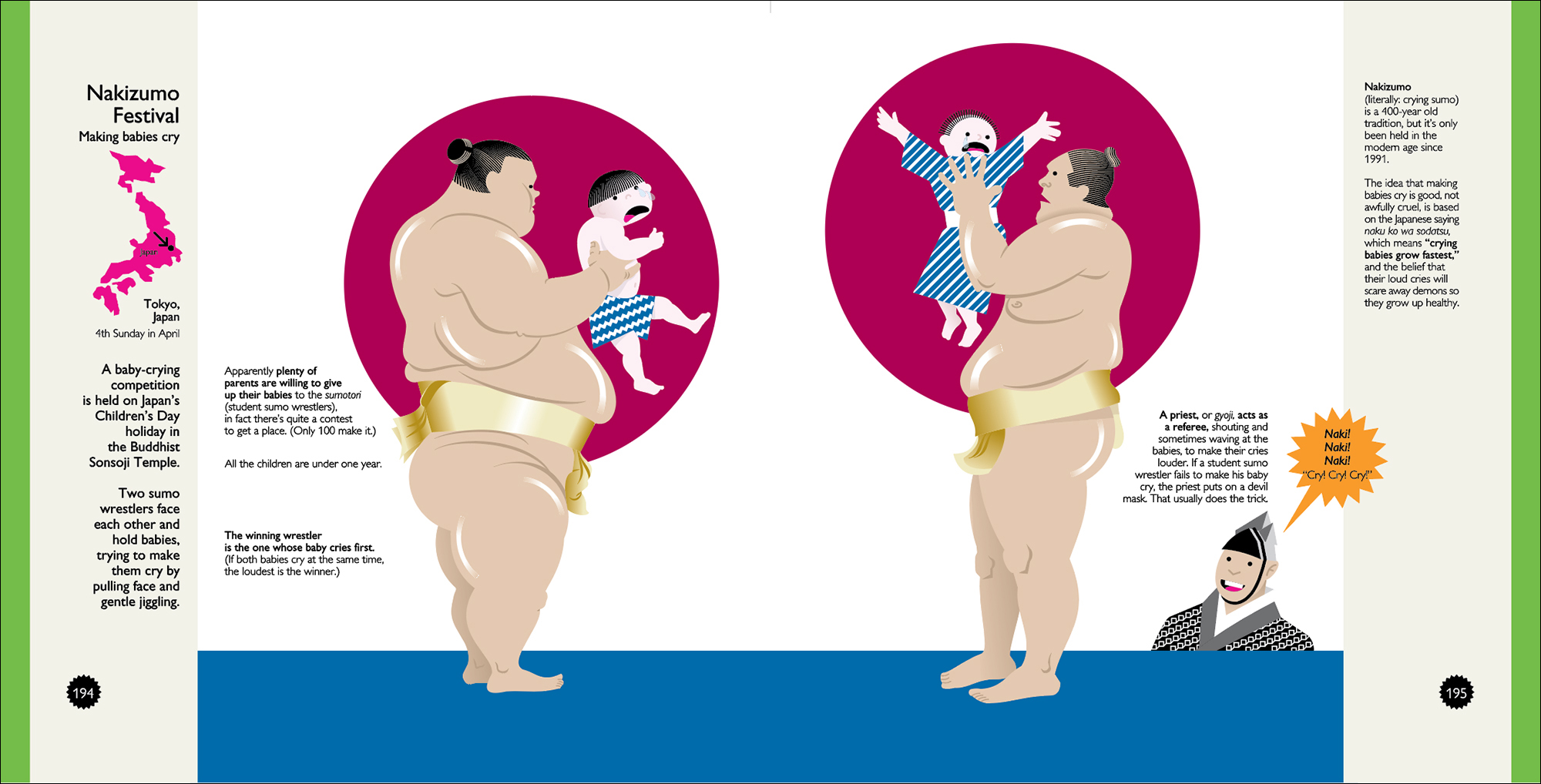
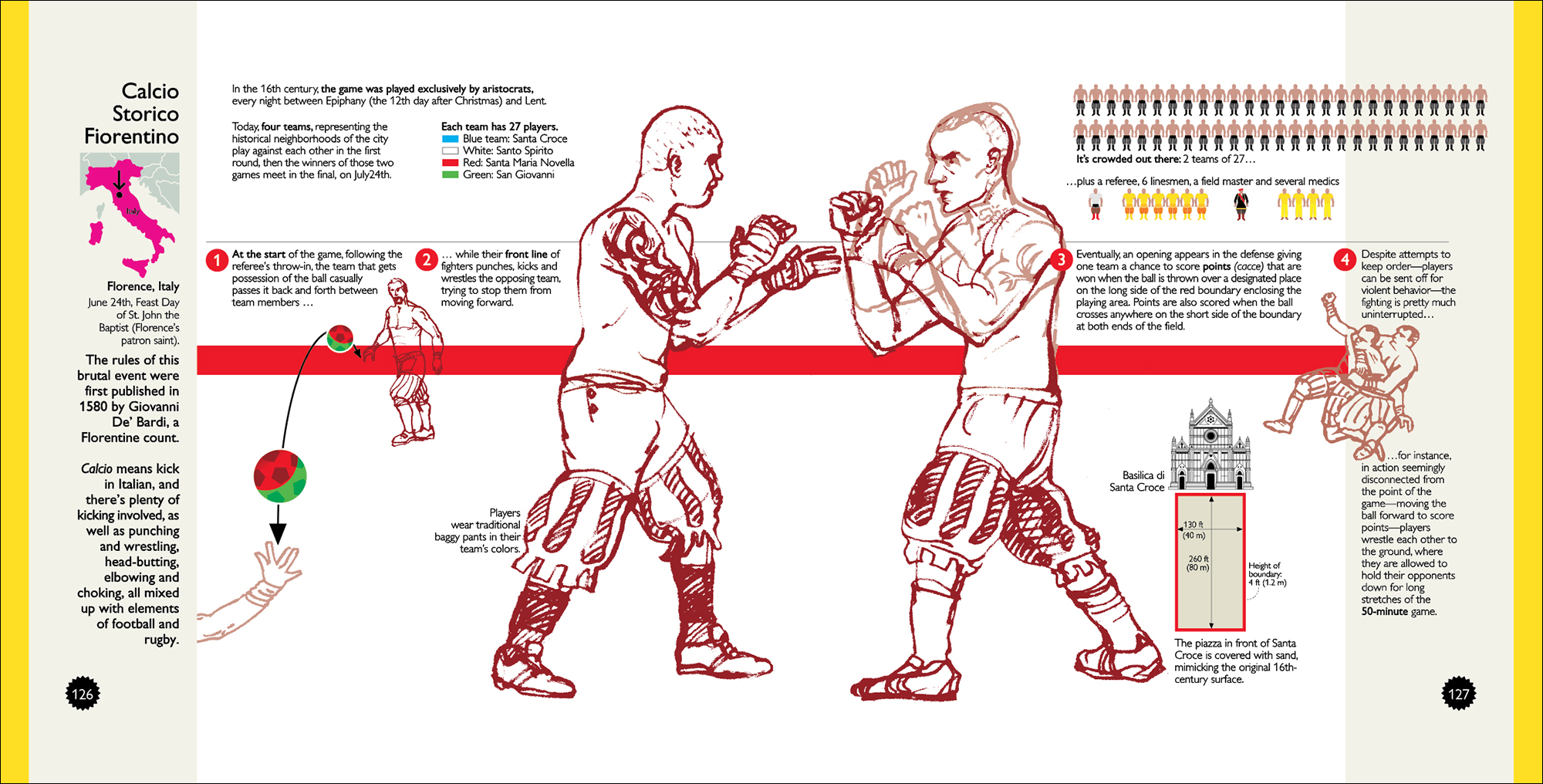
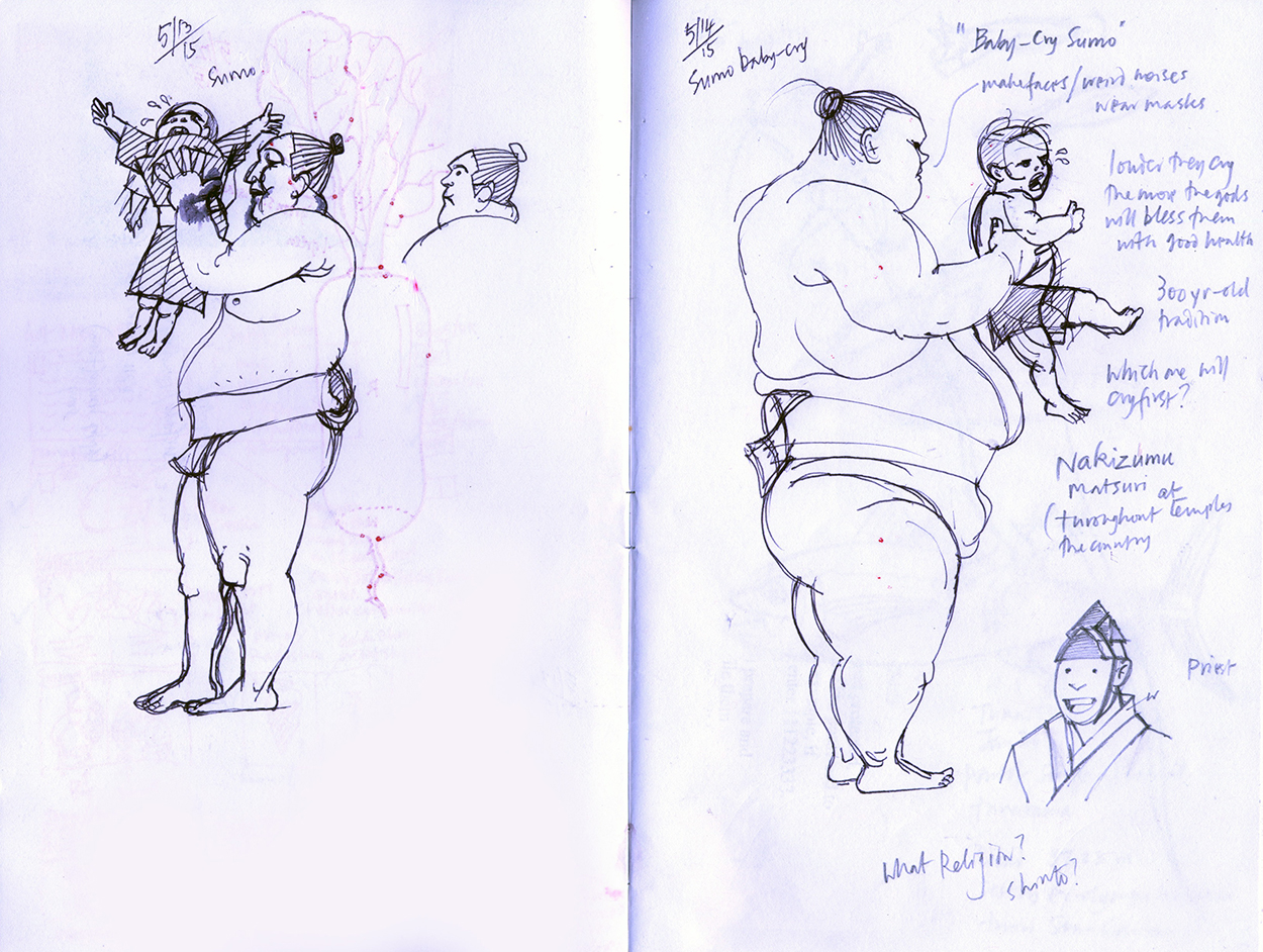
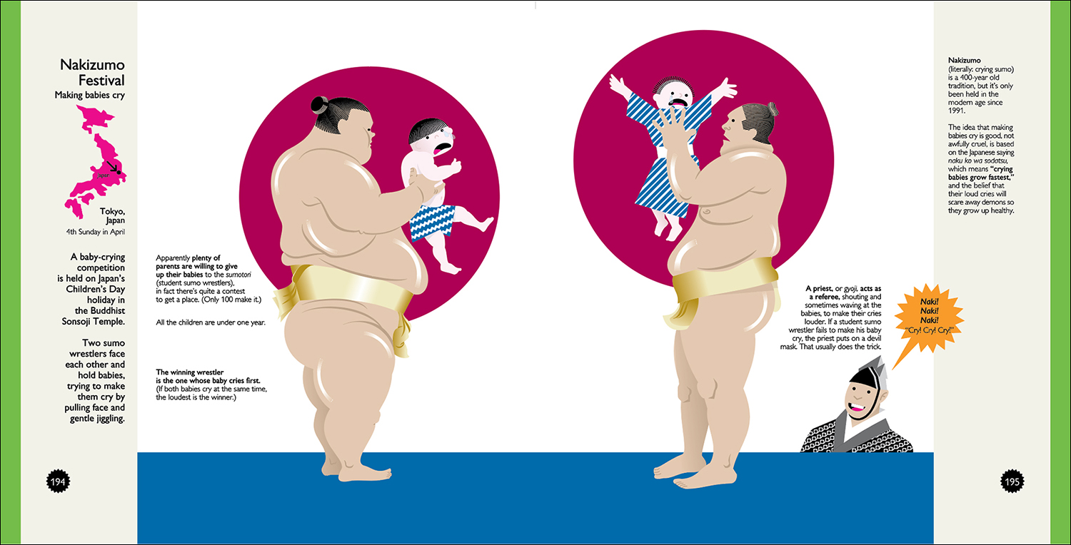
This event is the Nakizumo Festival (Sumo wrestlers making babies cry. No babies are harmed!) I worked with Chris Mizsak, a researcher in England, to find the best reference. Where possible, we used the official websites of the events, but sometimes I had to rely on press reports, both for specific details and pictorial reference. The example below is from the Tokyo Times.
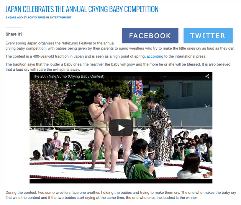
The first step for me in almost any information graphic is drawing by hand, even if it’s hand-plotted numbers for a chart. In this case, the end result was pretty much just a large illustration of two big sumo (student) wrestlers holding the hapless toddlers, so the actual drawings were key. (You can see a radish showing through on the left-hand page. That’s from the Night of the Radishes event!)
The drawings were scanned, flipped right to left, and placed into a spread. It’s still in the original portrait format, and has dummy type.
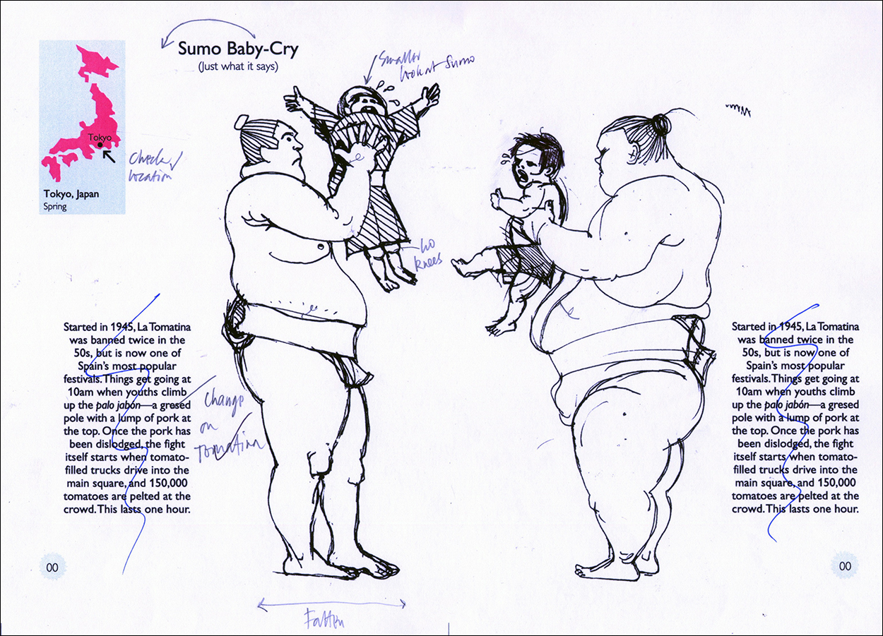
This is how the spread looked, with real type, but still in the old format, when sent to Taschen. Based on this and 11 other spreads, I got the go-ahead to do the whole book, but they wanted it to be square, and bigger. I showed them several of the original spreads in three different larger sizes, and they went with the biggest one (7.5 x 7.5 inches, 19 cm x 19 cm). At this time I decided to include two outer columns; on the left for the locator map and general introduction, and on the right for interesting trivia.
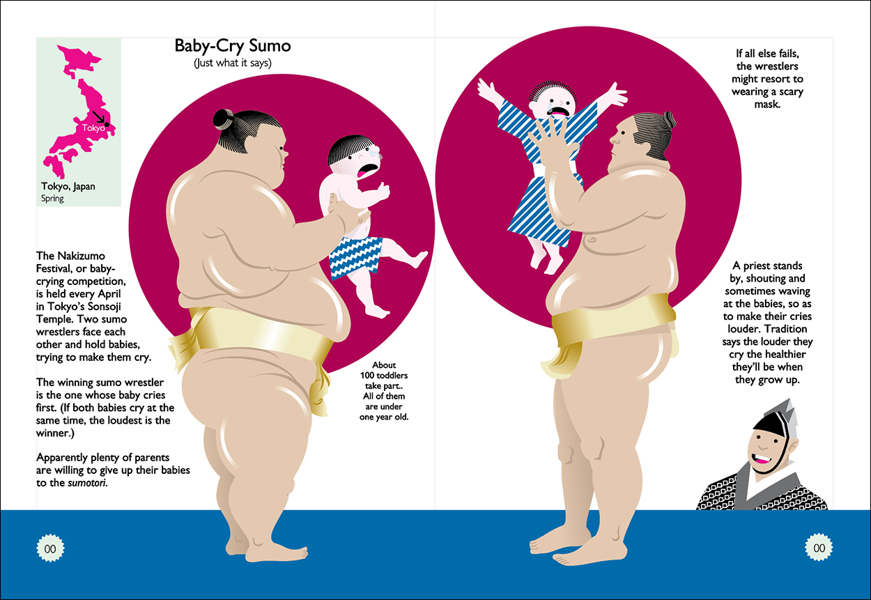
The final as it appears in the book. Since there were over 200 pages, I had to leave a fairly big gap in the center of each spread so stuff didn’t disappear into the gutter. It was easy to open up the sumo event, but some of the images in the book go right across the spread, and in retrospect I should have left more space in some cases. Oh well!
Click on the image for a larger version.
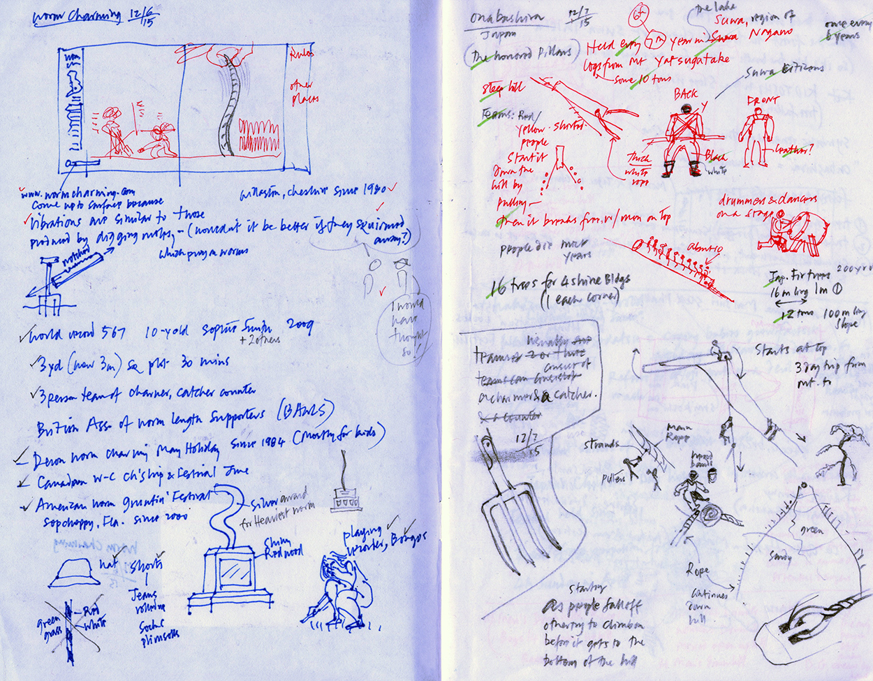
A typical spread from my notebook is often a hodgepodge of text ideas, reference notes and small drawings. Here are my notes for wormcharming (very safe, but wiggly!), and a particularly dangerous log-riding event held in Onbashira, Japan, which has resulted in the death of several participants over the years. Taschen never saw sketches; I always sent them final files, and all they did was to edit my text lightly for consistency. It was the best working relationship I’ve ever had.
We probably all have a competition or two that we find the most interesting (for various different reasons). For example, I used to think I had Olympic-level potential in stone-skimming. Do you have a favorite?
Two favorites: Kudu Dung Spitting, because it’s the most disgusting thing I can imagine! And, though it’s not a competition at all, the Twelfth Night Holly Man, because it came out the way I visualized it, and that didn’t happen every time!
Buy the book here: https://bit.ly/2LaKxJE

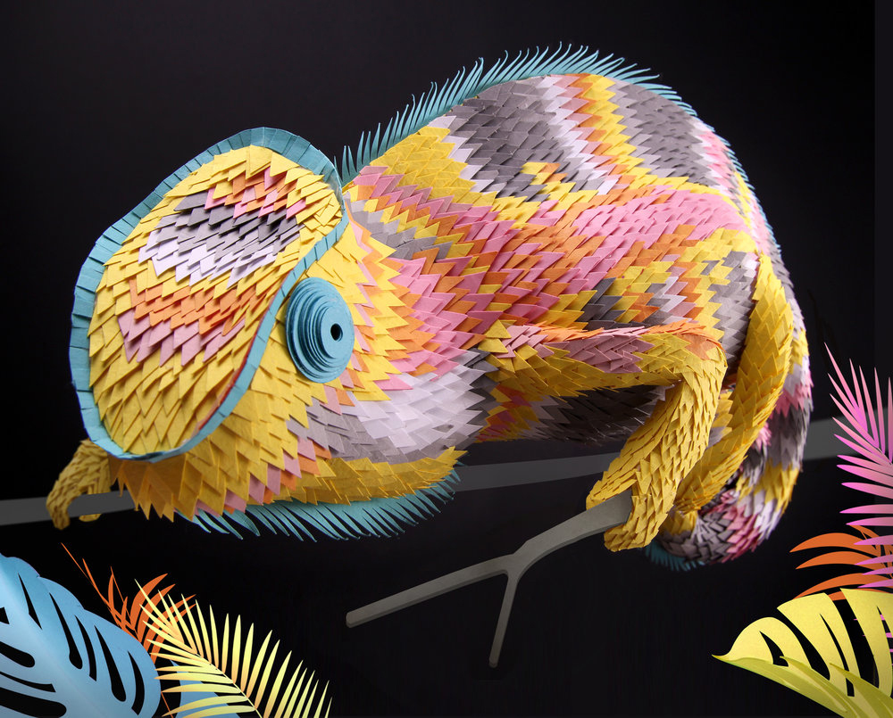
 Images © Marcus Lyons.
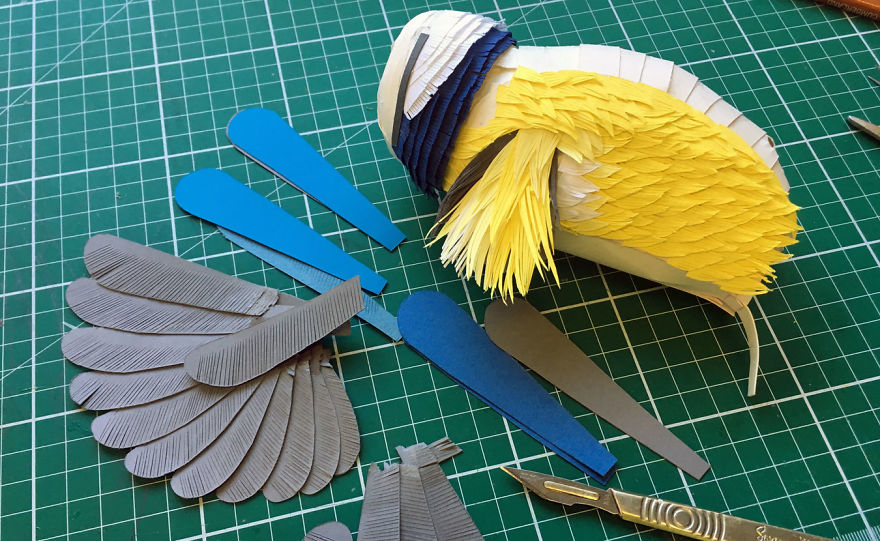
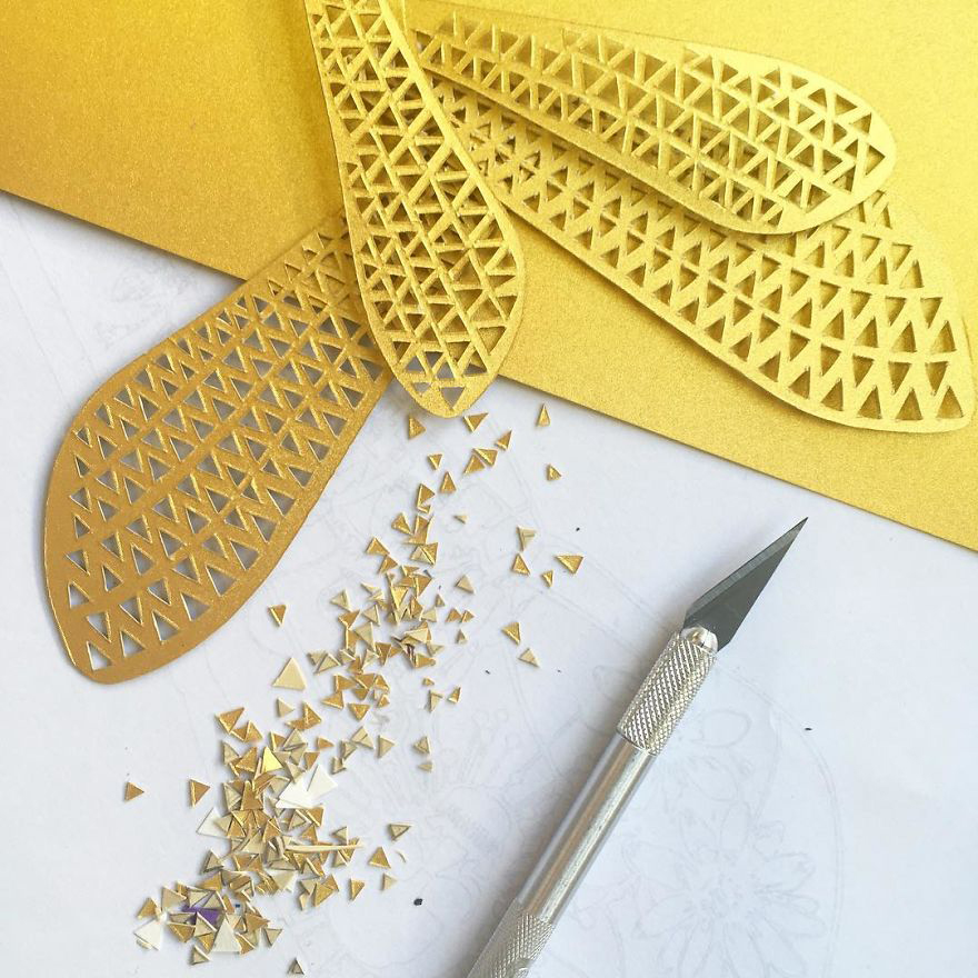